Children's Burn Foundation
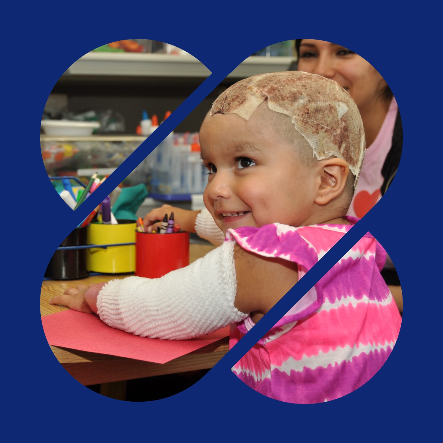
Redesign of Children's Burn Foundation visual identity to best represent their mission.
Redesign of Children's Burn Foundation visual identity to best represent their mission.
The challenge
Children's Burn Foundation is dedicated to supporting children burn victims and utilizing education to prevent burns. The foundation is upheld by three pillars, comprehensive care, education and support, yet the branding doesn't reflect this. CBF needs a new visual identity to better convey what their organization does for those under their care.
The idea
In our meetings with the foundation, we discovered that the support burn victims and their families get is what truly makes CBF unique, yet none of it is reflected in its visual presence. And while the current logo is well-loved, staff find it outdated and awkward to work with.
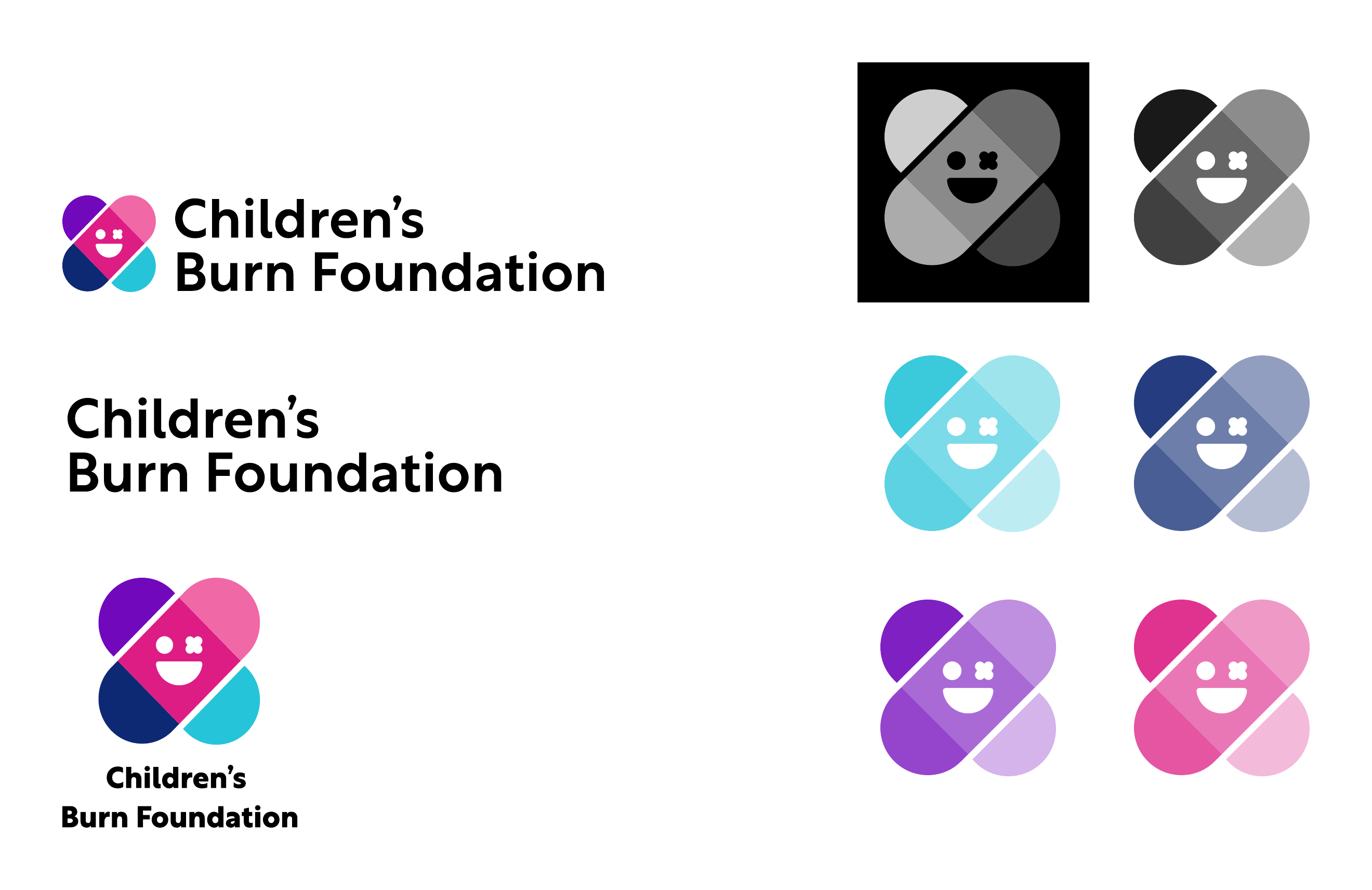
The redesign includes a new modular logo, typeface, tagline and color scheme that highlights the three pillars. The modular design portrays a professional yet playful personality that speaks to the foundation's commitment to healing children, supports ongoing campaigns like the superhero campaign, and utilizes simple geometry and many layouts for ease of use.
Color and type
A primary palette of cyan, navy, violet, magenta and pink, with orange and yellow as secondary colors. Rustica is the typeface throughout.

Logo development
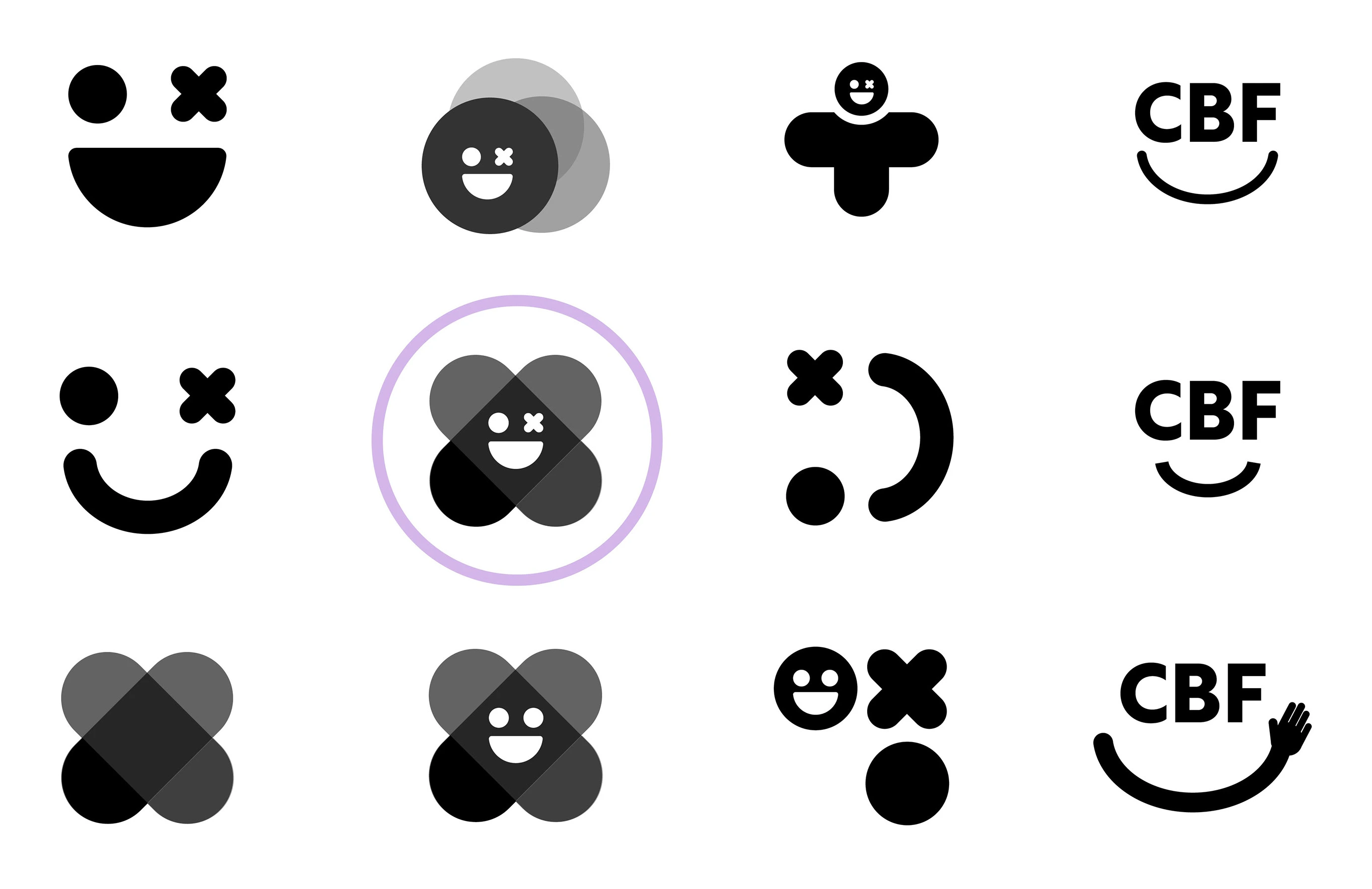
My professor and I agreed that this iteration would best represent Children's Burn Foundation and decided to continue in this direction.
The concept behind the logo
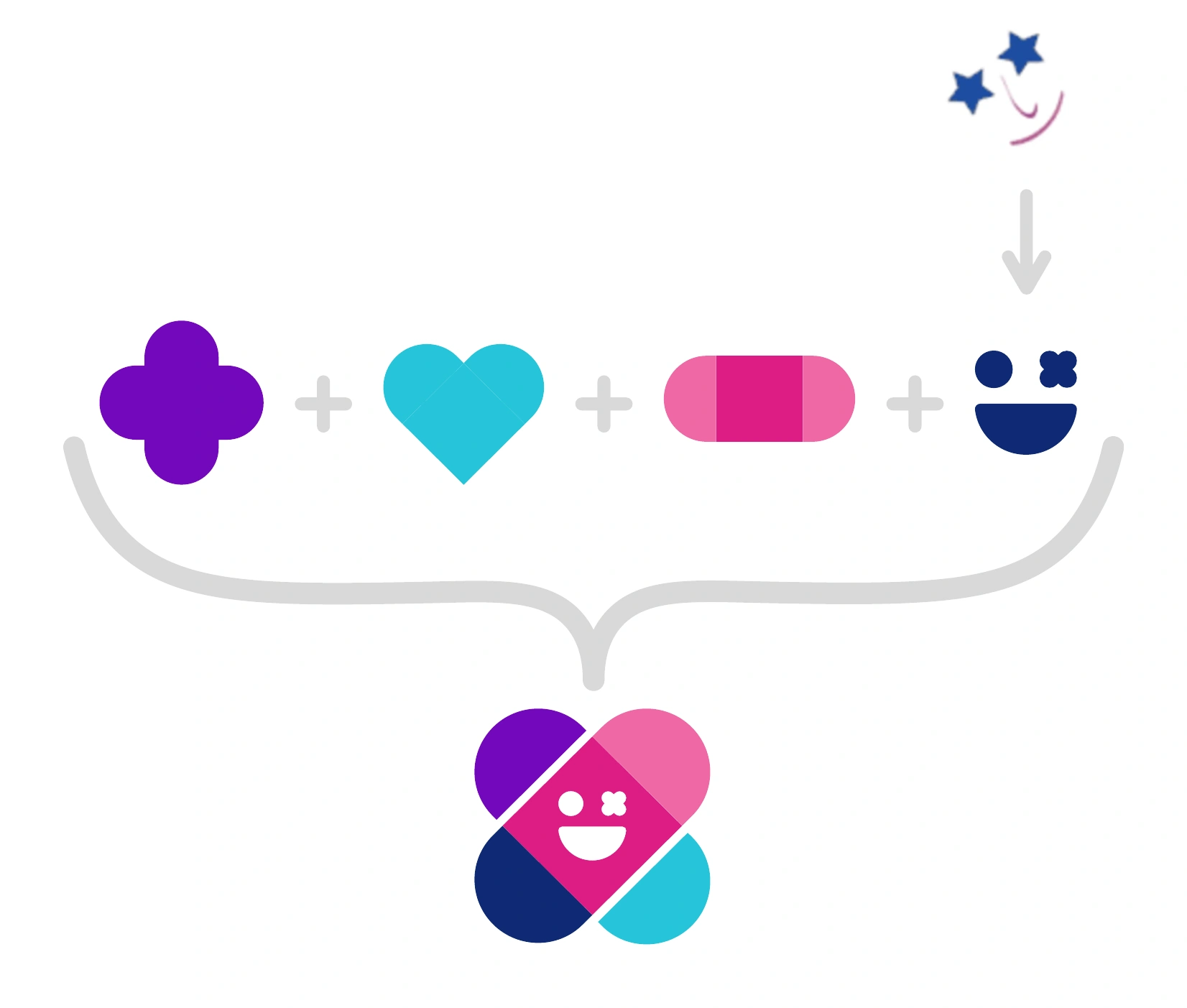
The goal was to maintain the successful aspects of the current logo, for example, the smiley face, and implement representations of comprehensive care, education and prevention.
Based on my research of medical symbology, I decided to utilize the cross, but I turned it on its side to represent prevention and education. The face pays homage to the smiley face with star eyes. The X also alludes to bandages, representing comprehensive care along with the smiley face. The coloration also loosely illustrates a heart, further representing comprehensive care. Lastly, the geometry of the shapes, especially in the eyes of the face, is reminiscent of XOXO (hugs and kisses), representing the warmth and support of the foundation.
Tagline
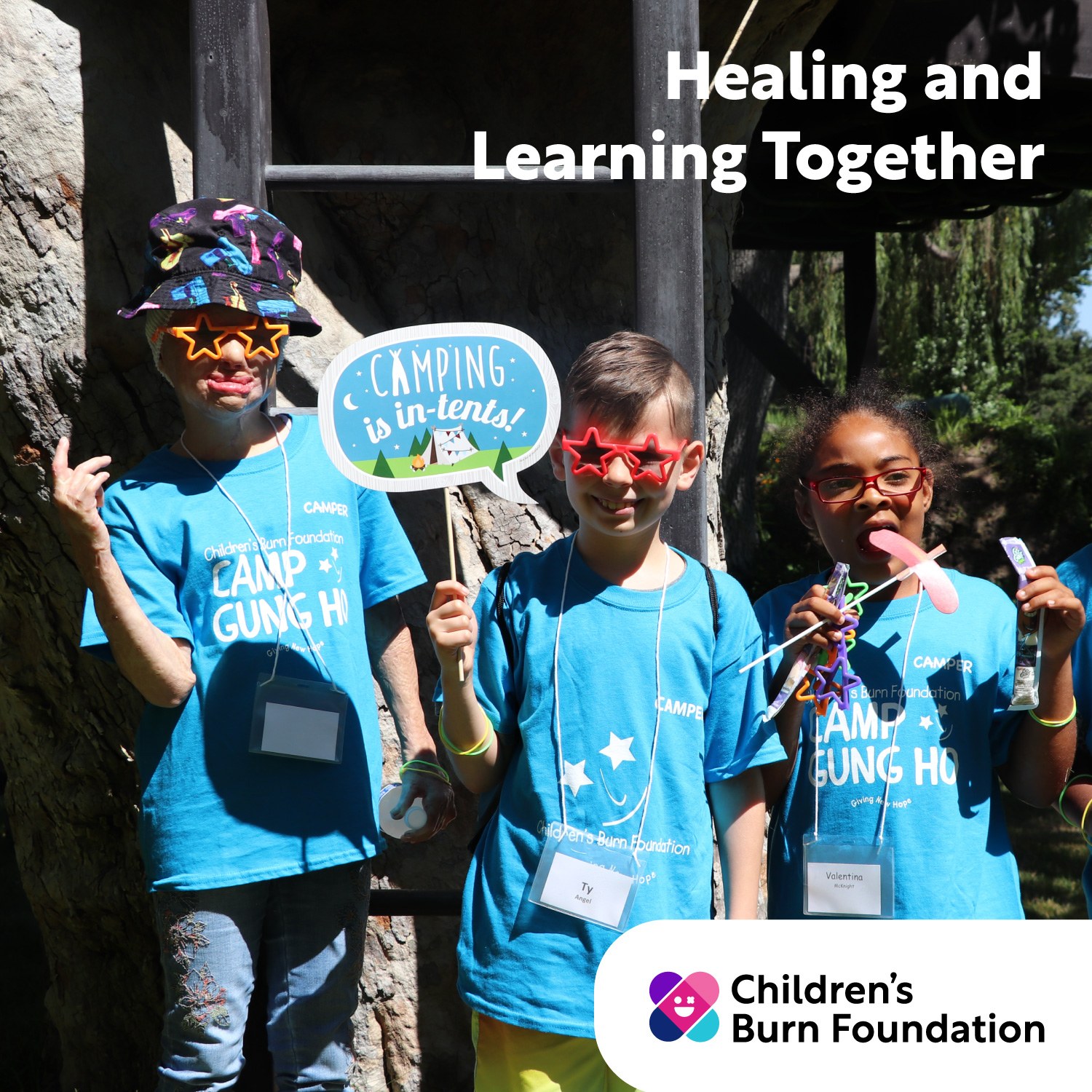
Inspired by a conversation with Kirstin, we decided on “Healing and Learning Together.”

Logo alternates
Modular use
General use audience: children, teachers, caregivers, parents, etc.
Professional use audience: donors.